Component
Library
Title
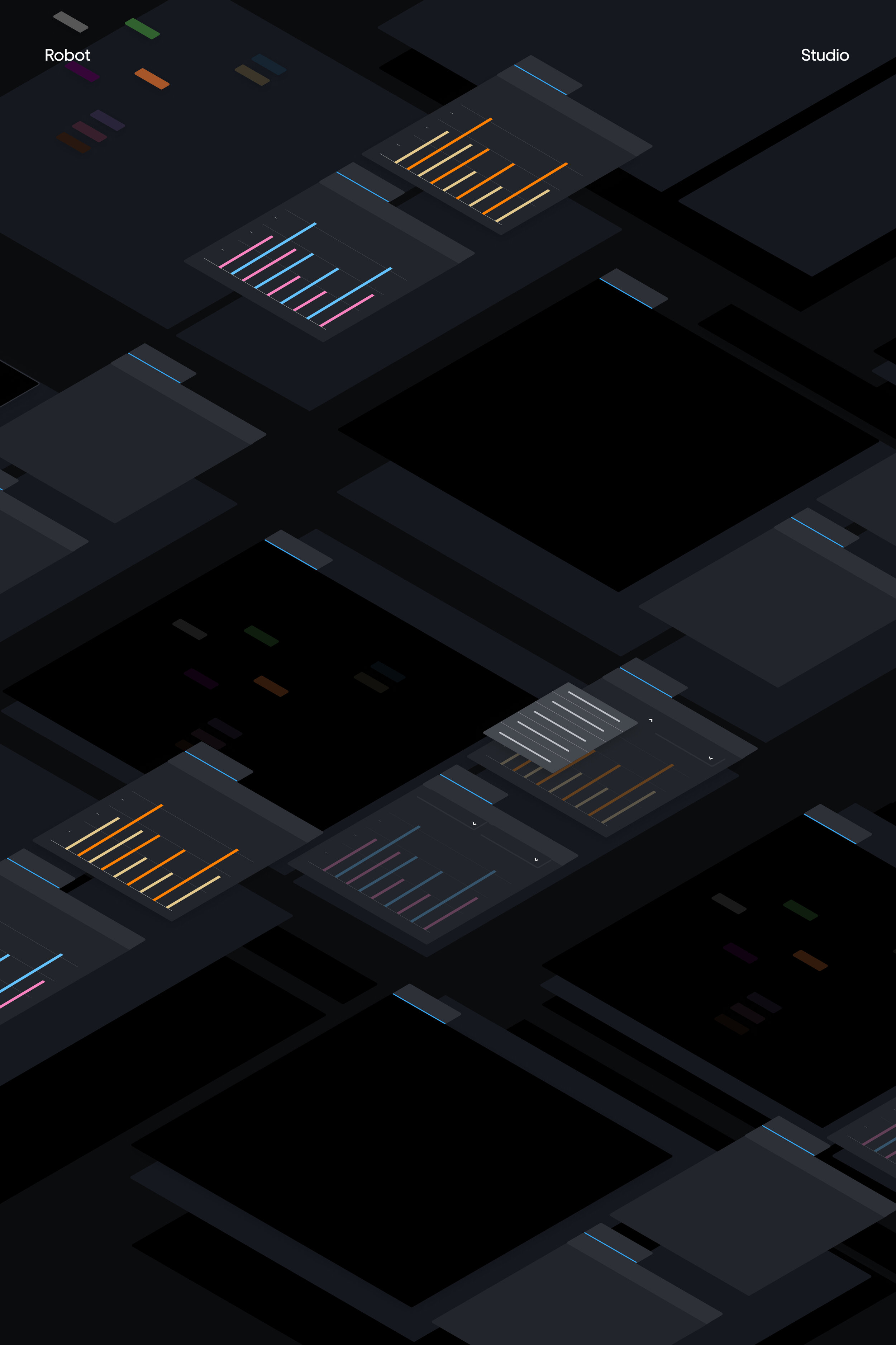
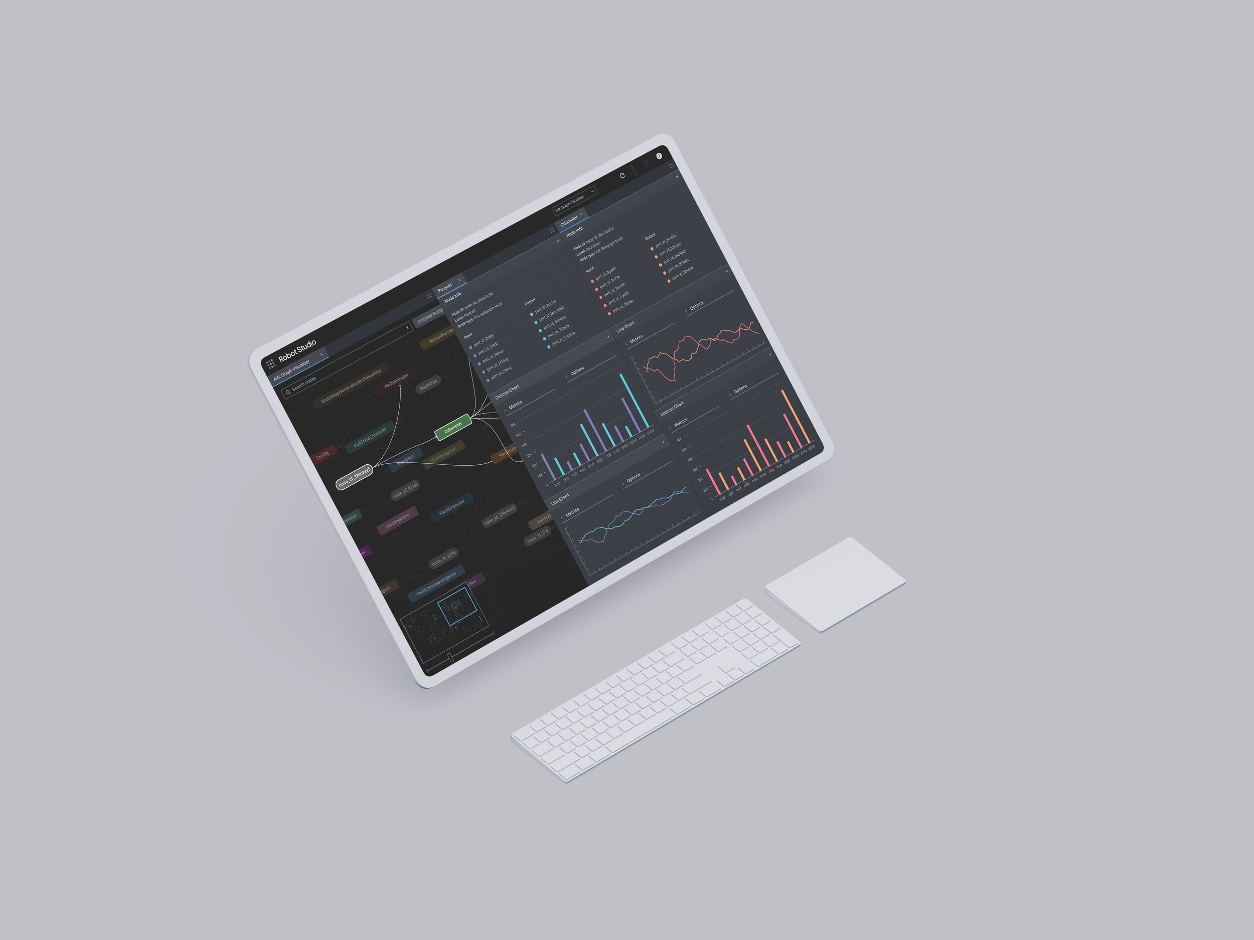
Uber ATG Tools Suite
Delorean Component Library
Role
Lead Product Designer

ATG Tools Suite
Delorean Design
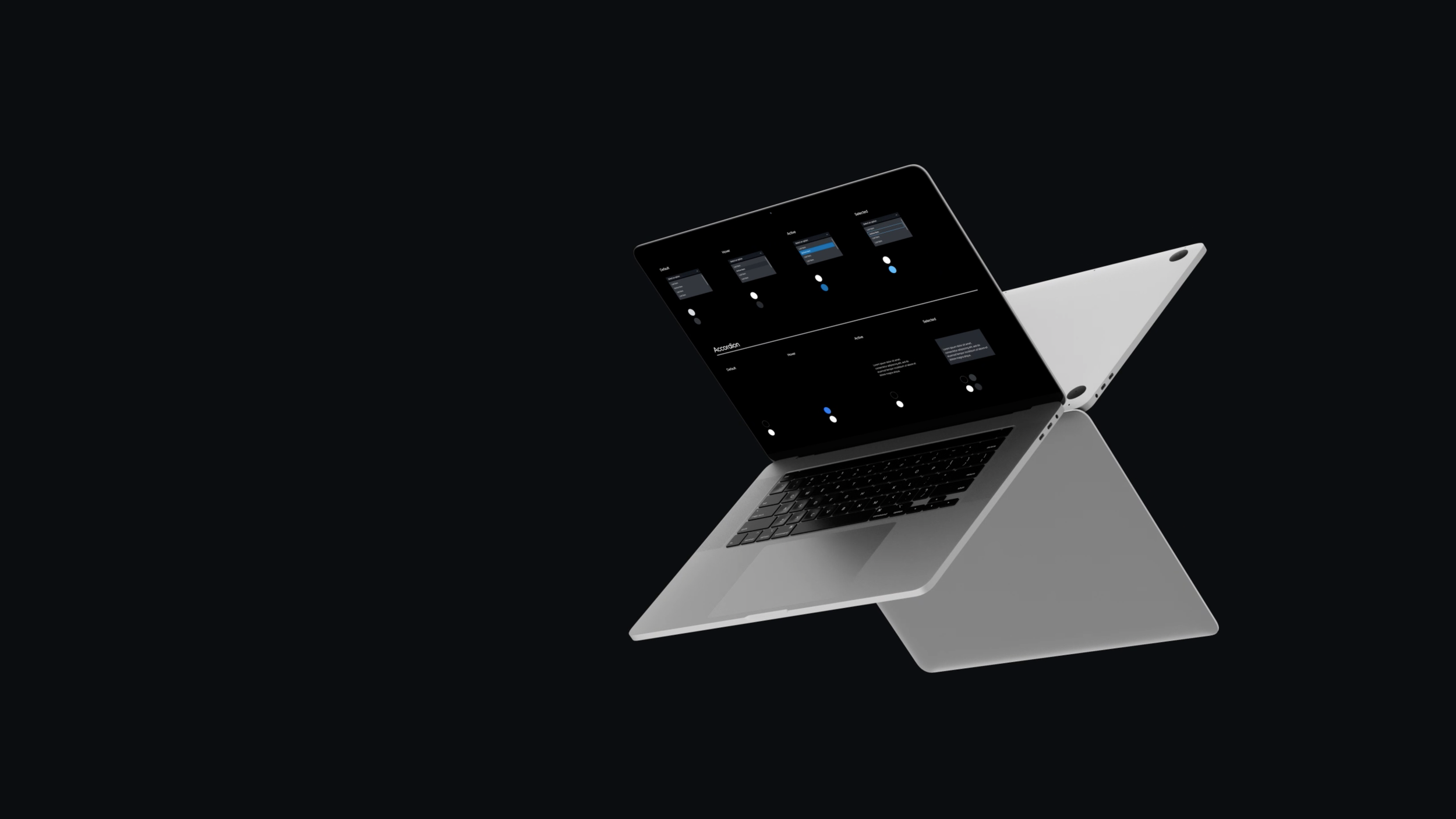
Components
A design system of reusable components, and the time you spend creating will level off over time. At that point, designers and front end developers can fine-tune existing products, add delight to the experience, or focus on other projects!
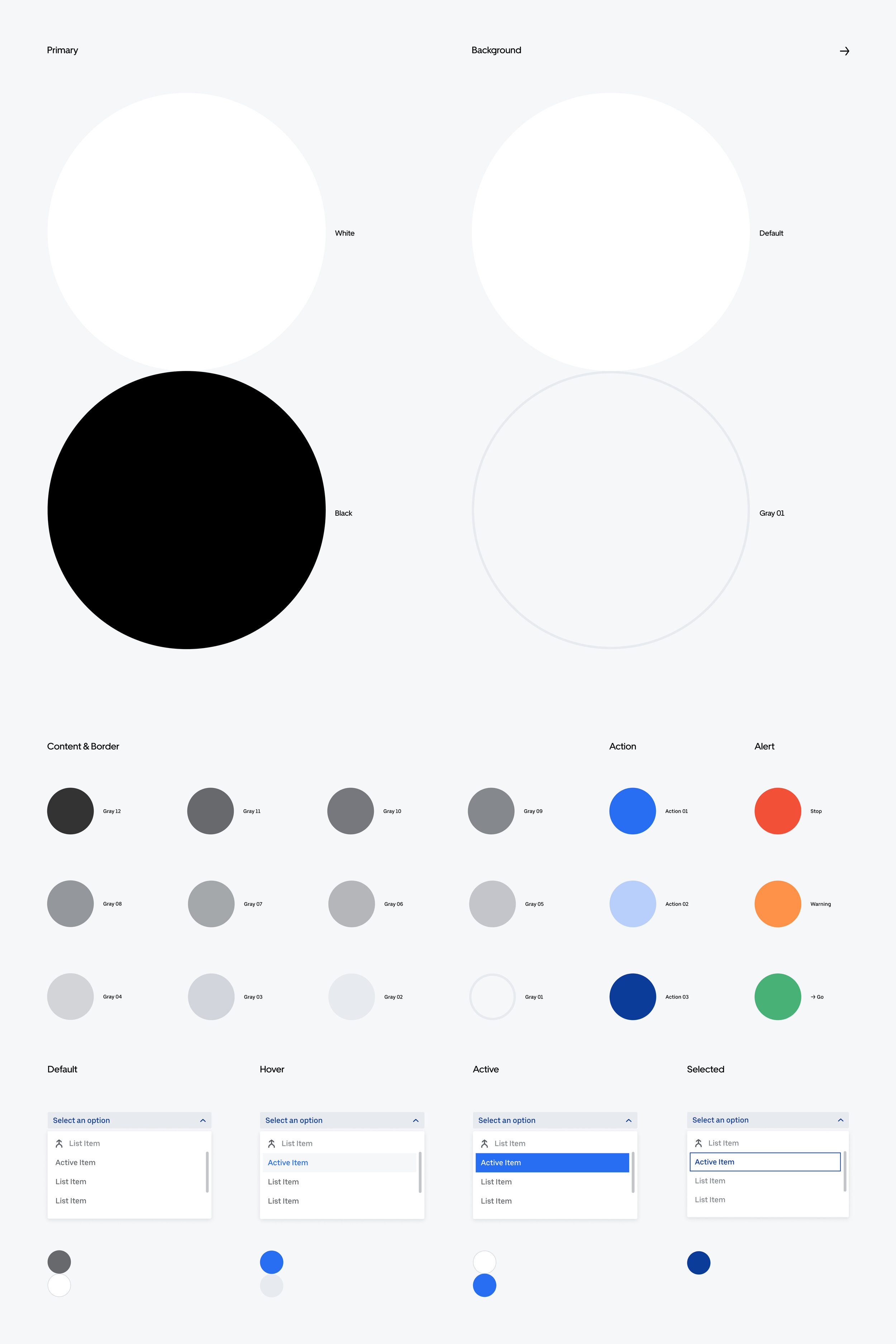
Color Usage
Delorean provides two default set of light theme background. Gray family serves as content and border color to provide visual hierarchy of UI surface area. Core blue family is suggested as primary action colors to inform component status.
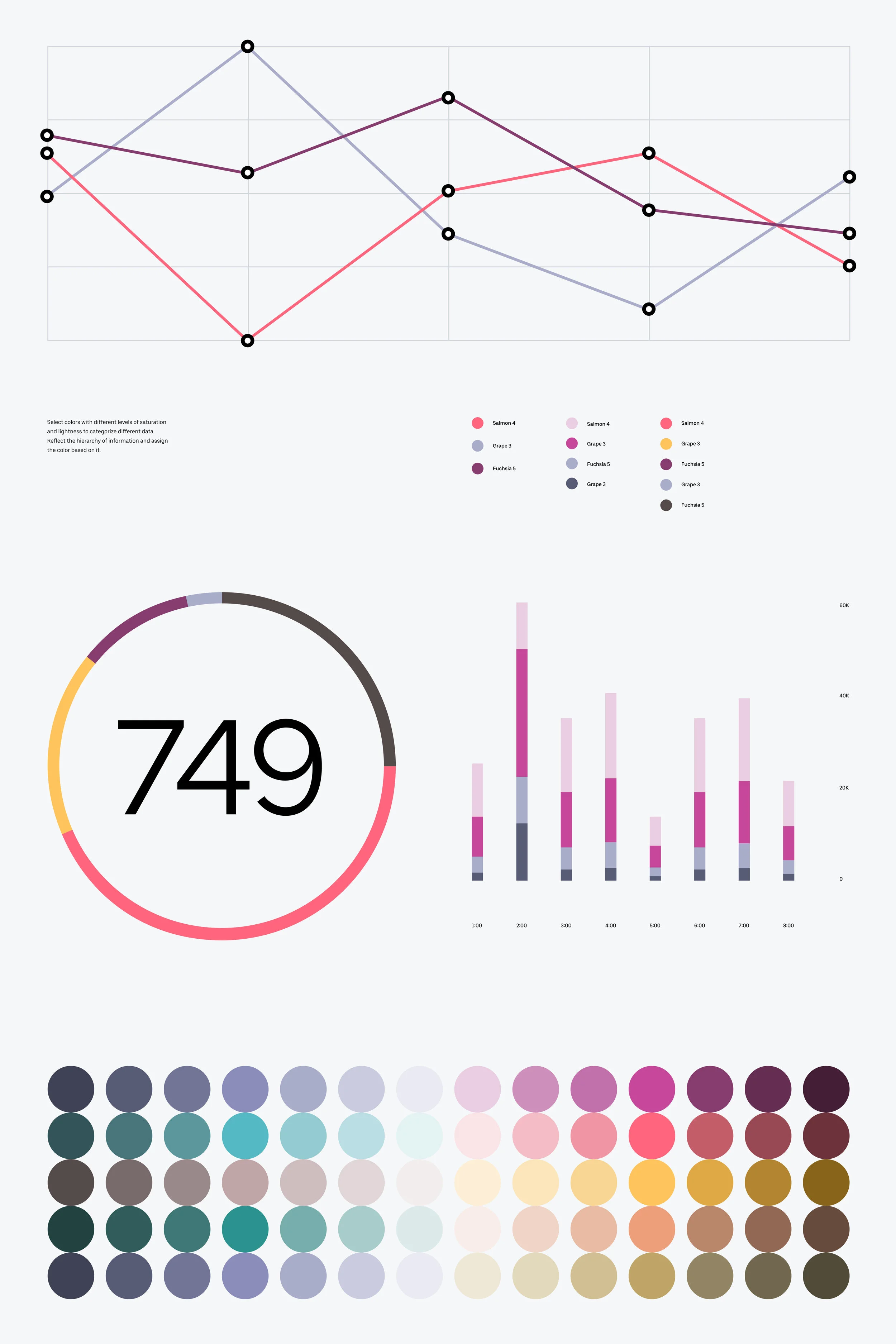
Data Color
Data color palettes are intended to maximize the accessibility of information and visual delight.
Buttons
Let users take action.
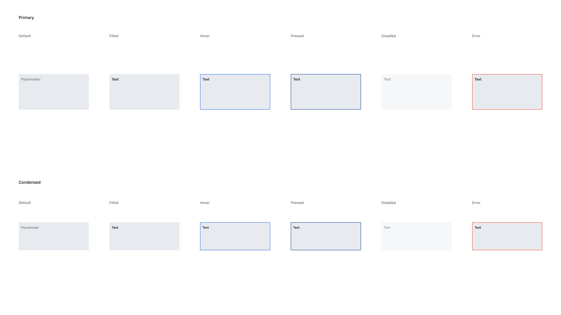
Inputs
Let users enter information.


Controls
Controls are used for making selections and toggling settings and states.


Progress
Progress indicators allow you to provide visual feedback when a user is waiting for a process to complete. Use progress indicators to display the ratio of completeness of a task to its total.
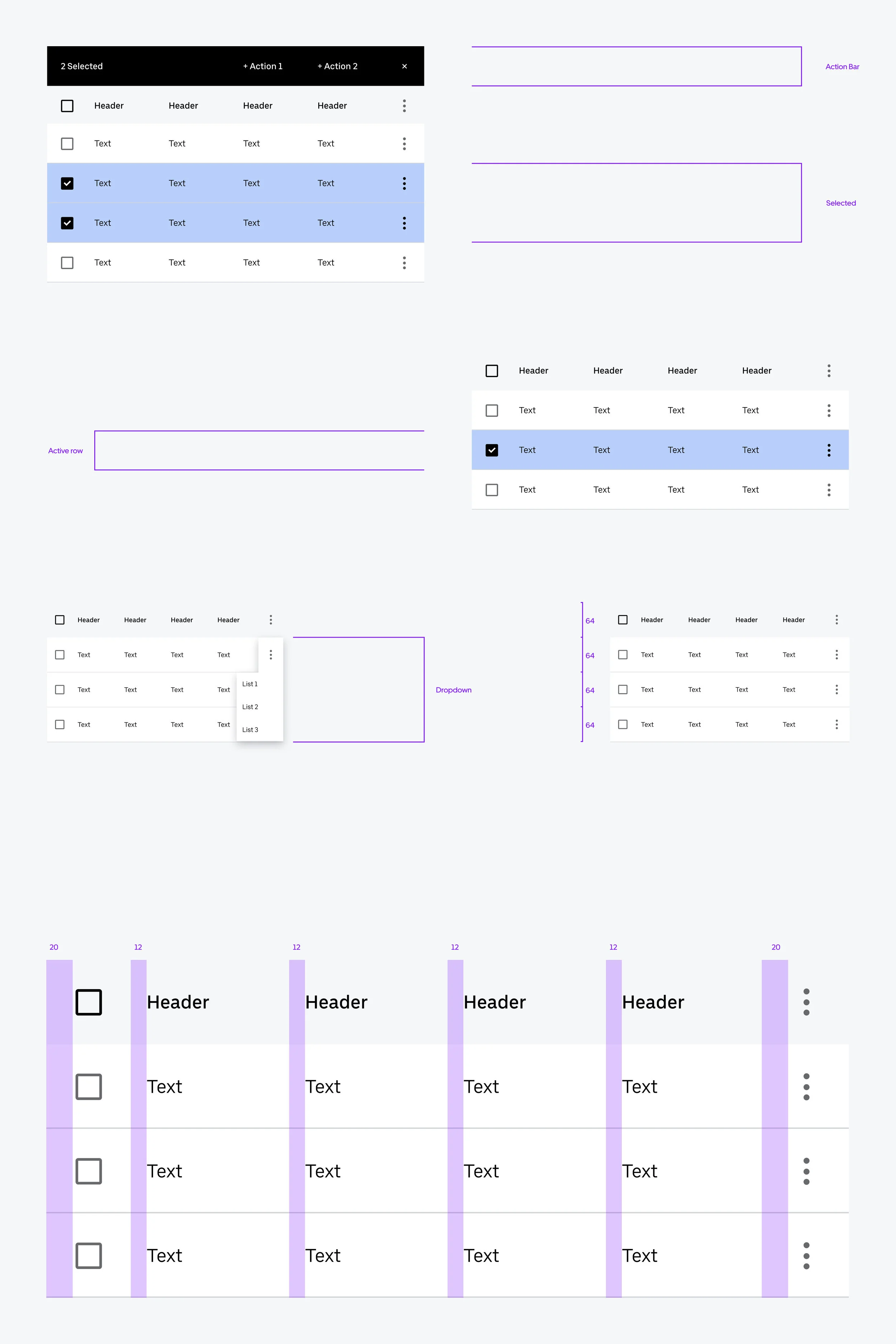
Table
Progress indicators allow you to provide visual feedback when a user is waiting for a process to complete. Use progress indicators to display the ratio of completeness of a task to its total.


Navigation
Top Bar provides sets of controls and options to users in the context of an application or panel. Each Top Bar has an App Icon and Title (App Name). Optional elements of a top bar include text and/or icon links, as well as an Avatar button that usually links to account settings.
Bars provide sets of controls and options to users in the context of an application or panel.


Credits
Peter Bentley
Nastasha Tan
Yeawon Kim
Jon Larkin